Comic Book Pop vs Pop: What's the Difference?
Comic Book Pop Art Style and Pop Art Style both use bold color, graphic shapes, and a lively, attention-grabbing look. They share roots in commercial imagery and print processes, but Comic Book Pop Art leans harder into sequential-art cues like strong black outlines, dramatic framing, and Ben Day dots.
People compare them because they can look similar at first glance: both often use flat color, thick outlines, and a playful, mass-produced feel. The difference is mostly in emphasis—Comic Book Pop Art feels more narrative and action-driven, while Pop Art Style is broader, more image-centric, and more closely tied to advertising and media aesthetics.
Same Prompt, Both Styles
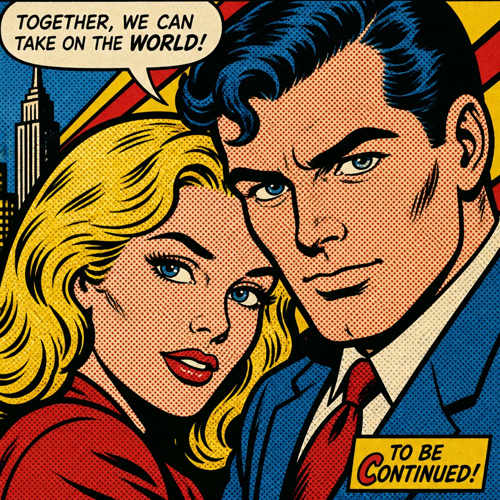
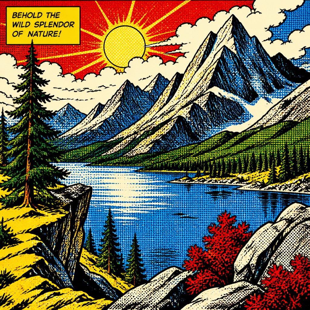
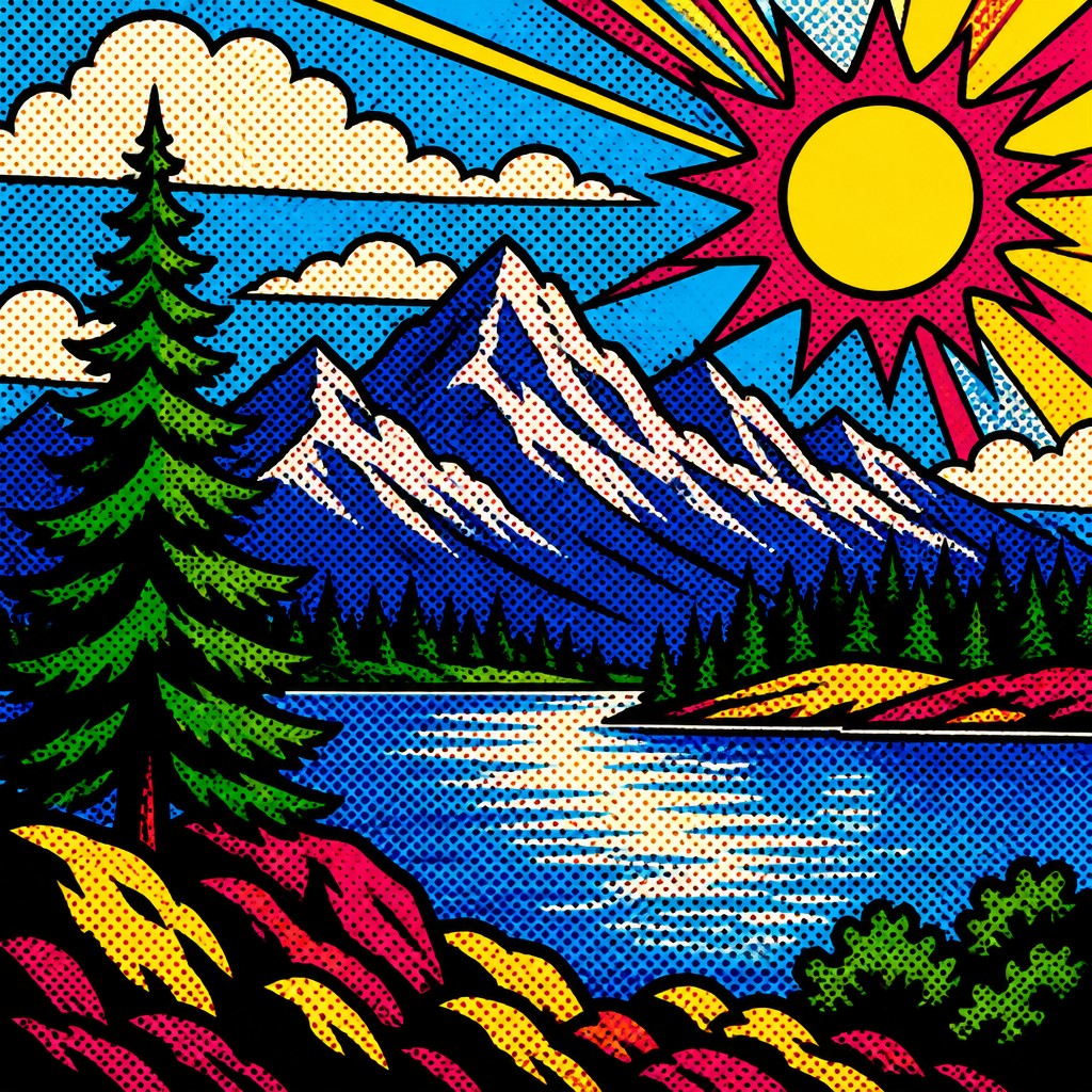
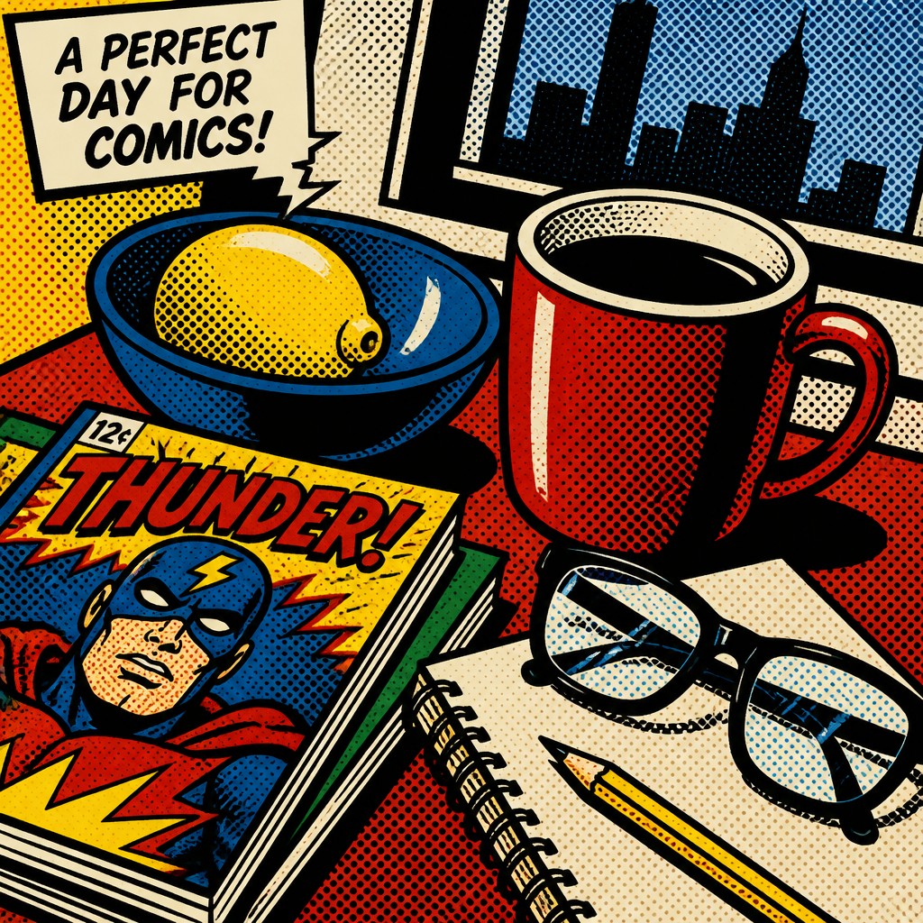
Each pair below was generated from the identical prompt — only the style changed.
“portrait of two people together”

“wide landscape with natural scenery”
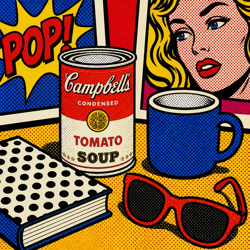
“still life with everyday objects”
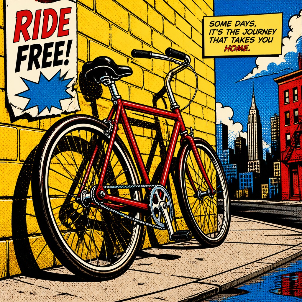
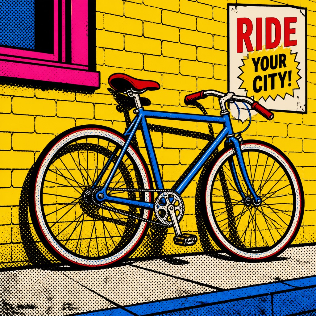
“bicyle resting against a wall”
Key Differences
| Comic Book Pop | Pop | |
|---|---|---|
| Line & form | Heavy outlines, panel-like shapes, and exaggerated contours create comic-book immediacy. | Thick outlines too, but forms feel cleaner and more general-purpose. |
| Patterning | Ben Day dots are a defining feature, echoing printed comics. | Halftone dots are common, but not as specifically comic-coded. |
| Color | Uses vivid primaries for high-contrast, punchy drama. | Uses flat, bold color with a wider commercial palette. |
| Mood | Feels explosive, theatrical, and story-oriented. | Feels cool, iconic, and mass-media driven. |
| Composition | Often mimics action panels, cropped scenes, and dynamic angles. | Often centers on single images, logos, or repeated consumer motifs. |
| Narrative energy | Suggests movement, conflict, and comic storytelling. | Suggests branding, advertising, and everyday media culture. |
| Mood | playful, bold, nostalgic, graphic | bold, playful, commercial, ironic, vibrant |
| Energy | lively | lively |
| Detail level | moderate | moderate |
| Color | saturated primaries with stark black accents | bright saturated primaries and contrasts |
| Texture | flat fills, halftone dots, crisp linework | flat, printed, dot-patterned surface |
| Origin | mid-20th-century American comics and pop art | 1960s Britain and United States |
| Best for | posters, album covers, editorial illustration, comics, merchandise, advertising | posters, album covers, editorial graphics, advertisements, book covers, merchandise design |
| Difficulty | moderate | moderate |
Which Should You Choose?
Pick Comic Book Pop Art Style if you want something that feels like a scene from a comic: dramatic, kinetic, and visibly print-driven. Choose Pop Art Style if you want a broader pop culture look that feels more like advertising, packaging, or mass-media imagery. In short, A is better for action and story cues, while B is better for iconic, commercial simplicity.
Frequently Asked Questions
Are Comic Book Pop Art Style and Pop Art Style basically the same?
They overlap a lot, especially in bold outlines, flat color, and printed-dot texture. The key difference is that Comic Book Pop Art Style is more directly tied to comic-book visuals and storytelling.
Which style uses Ben Day dots more often?
Comic Book Pop Art Style is more strongly associated with Ben Day dots. Pop Art Style may use halftone dots instead, which feel similar but are less specifically comic-inspired.
Which style is better for a poster or cover?
If you want action, tension, or a narrative moment, Comic Book Pop Art Style usually works better. If you want a bold, iconic, advertisement-like image, Pop Art Style is often the stronger choice.
Can both styles use the same colors and outlines?
Yes, both commonly use flat color and thick outlines, so they can look related. The distinction usually comes from texture, composition, and whether the image feels like a comic panel or a commercial image.