Color Field Painting vs Minimalism: What's the Difference?
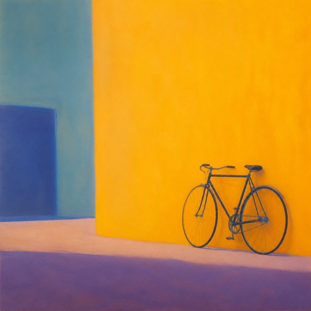
Color Field painting uses expansive areas of flat or subtly modulated color to create a quiet, immersive visual experience. Instead of depicting objects or scenes, it focuses on how color can shape mood, space, and attention, often with soft edges and a sense of visual depth.
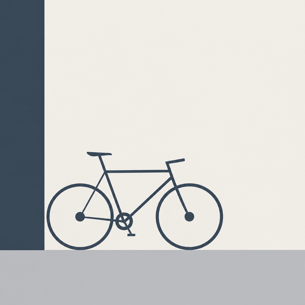
Minimalism, by contrast, reduces art to essential forms, often using simple geometry, limited color, and open space. People compare the two because both avoid narrative imagery and rely on restraint, yet they differ in emphasis: Color Field centers on the emotional and optical power of color, while Minimalism emphasizes structure, clarity, and reduction.
Same Prompt, Both Styles
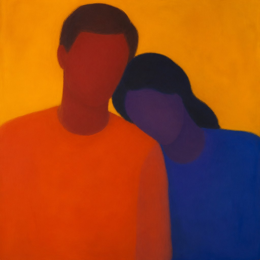
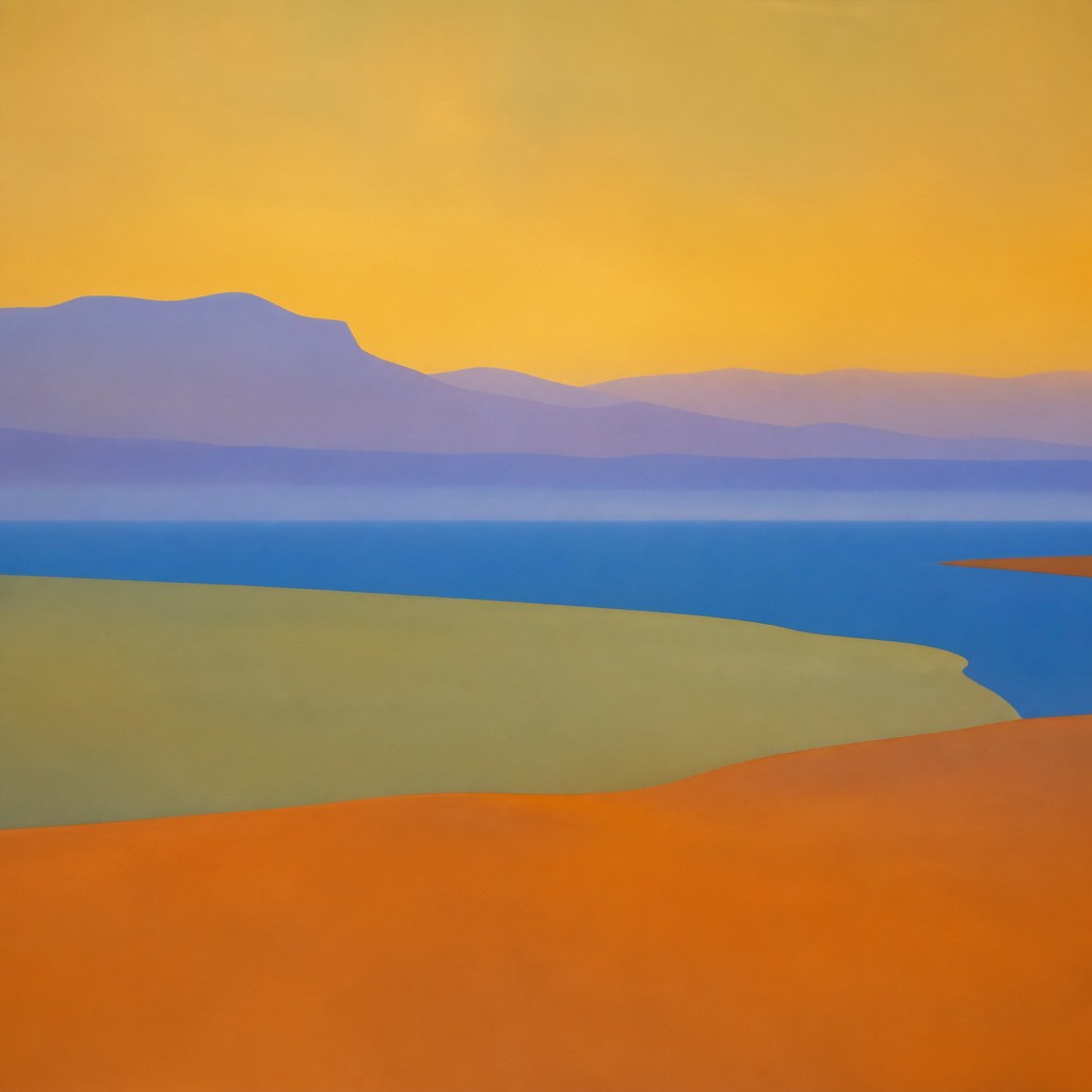
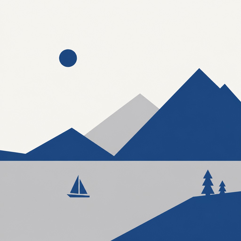
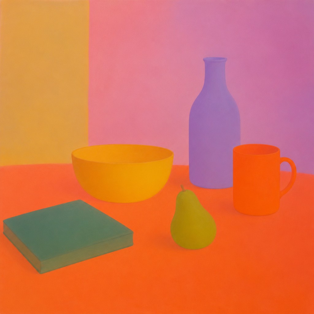
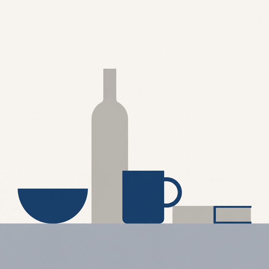
Each pair below was generated from the identical prompt — only the style changed.
“portrait of two people together”

“wide landscape with natural scenery”
“still life with everyday objects”
“bicyle resting against a wall”
Key Differences
| Color Field Painting | Minimalism | |
|---|---|---|
| Primary focus | Color creates atmosphere and immersion. | Form and reduction create clarity. |
| Line & form | Edges are soft; shapes often dissolve into fields. | Edges are crisp; forms are usually geometric. |
| Color use | Broad, often nuanced color dominates the work. | Color is limited and used sparingly. |
| Spatial effect | Suggests depth through layered color and scale. | Emphasizes flatness and open negative space. |
| Visual experience | Slow, meditative, and immersive. | Direct, concise, and intentionally restrained. |
| Composition | Composition is often centered on large uninterrupted zones. | Composition often organizes a few precise elements. |
| Mood | meditative, expansive, quiet, contemplative, austere | calm, restrained, austere, meditative |
| Energy | serene | serene |
| Detail level | minimal | minimal |
| Color | broad, luminous, often saturated fields | limited palette, often monochrome or muted |
| Texture | smooth, flat, lightly varied surfaces | flat, smooth, crisp-edged |
| Origin | mid-20th century America | 1960s United States and Europe |
| Best for | posters, album covers, gallery prints, book jackets, branding backgrounds | posters, gallery installations, branding, editorial layouts, logos, architectural visuals |
| Difficulty | beginner-friendly | beginner-friendly |
Which Should You Choose?
Choose Color Field painting if you want a work that feels contemplative, expansive, and emotionally driven by color itself. Choose Minimalism if you prefer clean structure, geometric order, and a visual language that removes everything nonessential. In short, pick A for immersive color experience and B for reduced, architectural clarity.
Frequently Asked Questions
Are Color Field painting and Minimalism the same thing?
No. They can look similar in their simplicity, but they are built on different priorities. Color Field painting emphasizes the expressive power of large color areas, while Minimalism focuses on reducing form, color, and composition to essentials.
Which style uses more color?
Color Field painting usually uses more color, often in broad fields with subtle shifts and soft transitions. Minimalism generally limits color to a small palette, sometimes using only one or a few tones.
Which style feels more emotional?
Color Field painting is often experienced as more emotional or meditative because color is the main source of impact. Minimalism can also be expressive, but its effect is usually cooler, quieter, and more analytical.
Which style is easier to recognize at a glance?
Minimalism is often easier to identify because its geometric shapes, empty space, and limited palette are very distinctive. Color Field painting may seem even simpler at first, but its soft edges and layered color relationships are more subtle.