Collage Pop vs Pop: What's the Difference?
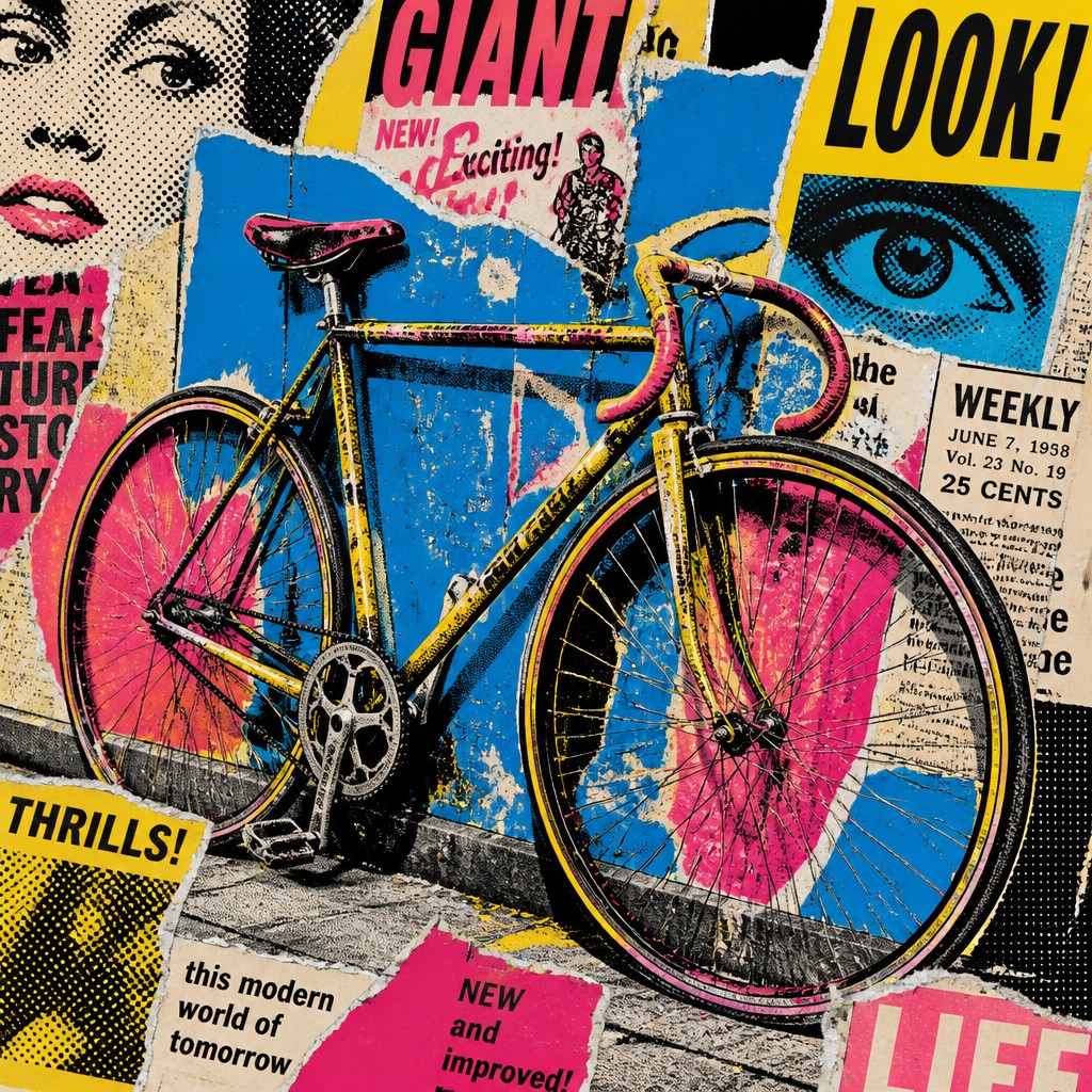
Collage Pop Art Style combines cut-paper layering, torn print textures, halftones, and bold CMYK color to create a lively, assembled-from-media look. It often feels tactile and noisy, as if advertisements, magazines, and posters were physically rebuilt into one image.
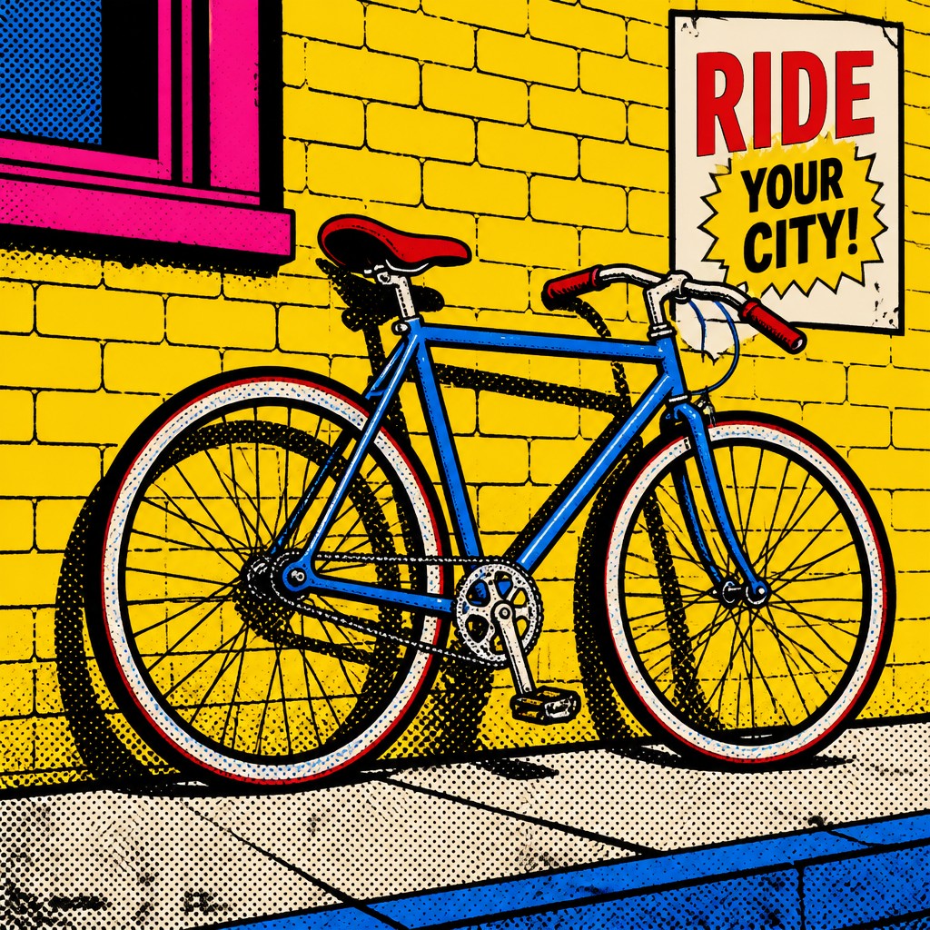
Pop Art Style uses flat color, thick outlines, halftone dots, and strong commercial imagery to deliver a cleaner, more immediate graphic punch. People compare the two because both borrow the energy of mass media, but one emphasizes collage texture and fragmentation while the other emphasizes clarity and direct visual impact.
Same Prompt, Both Styles
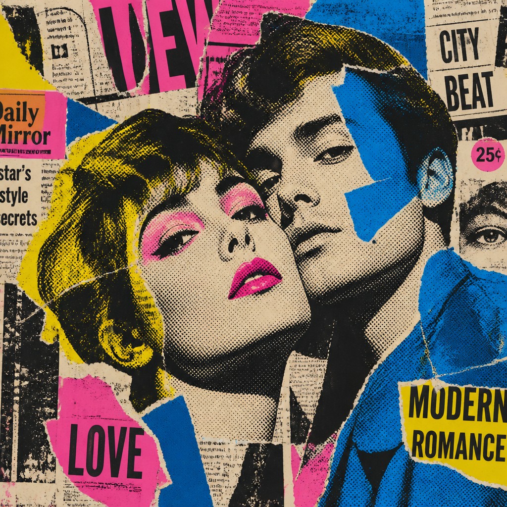
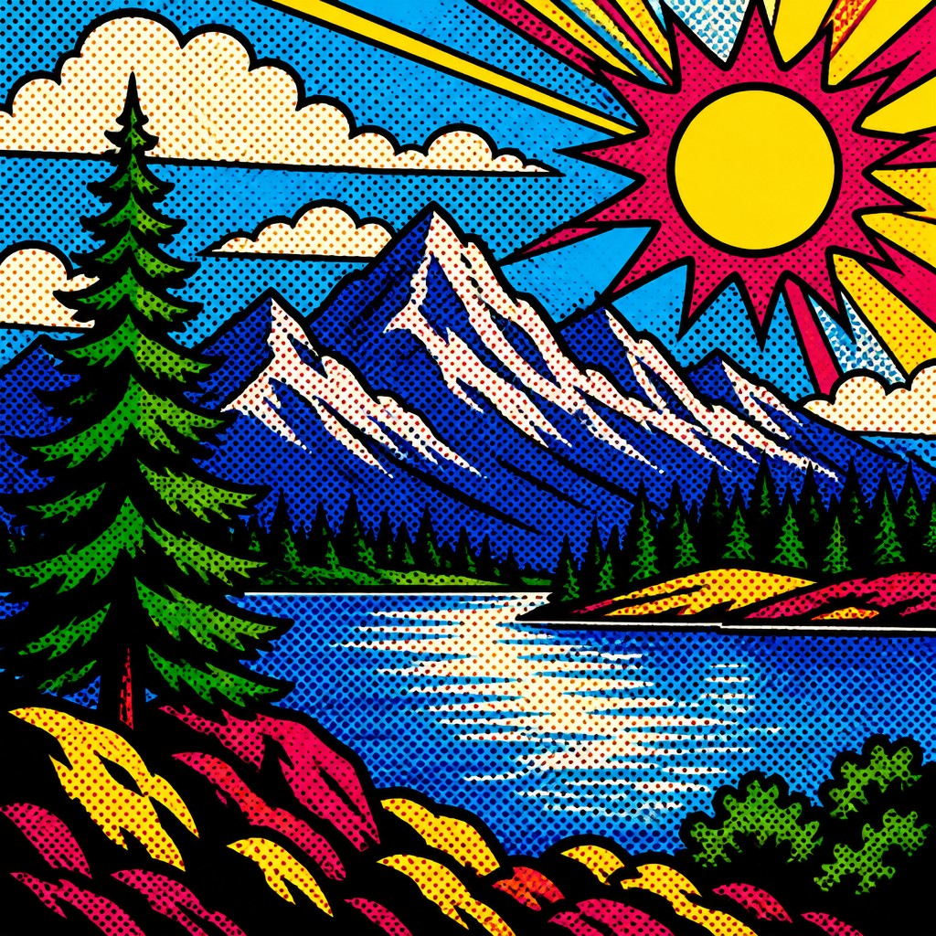
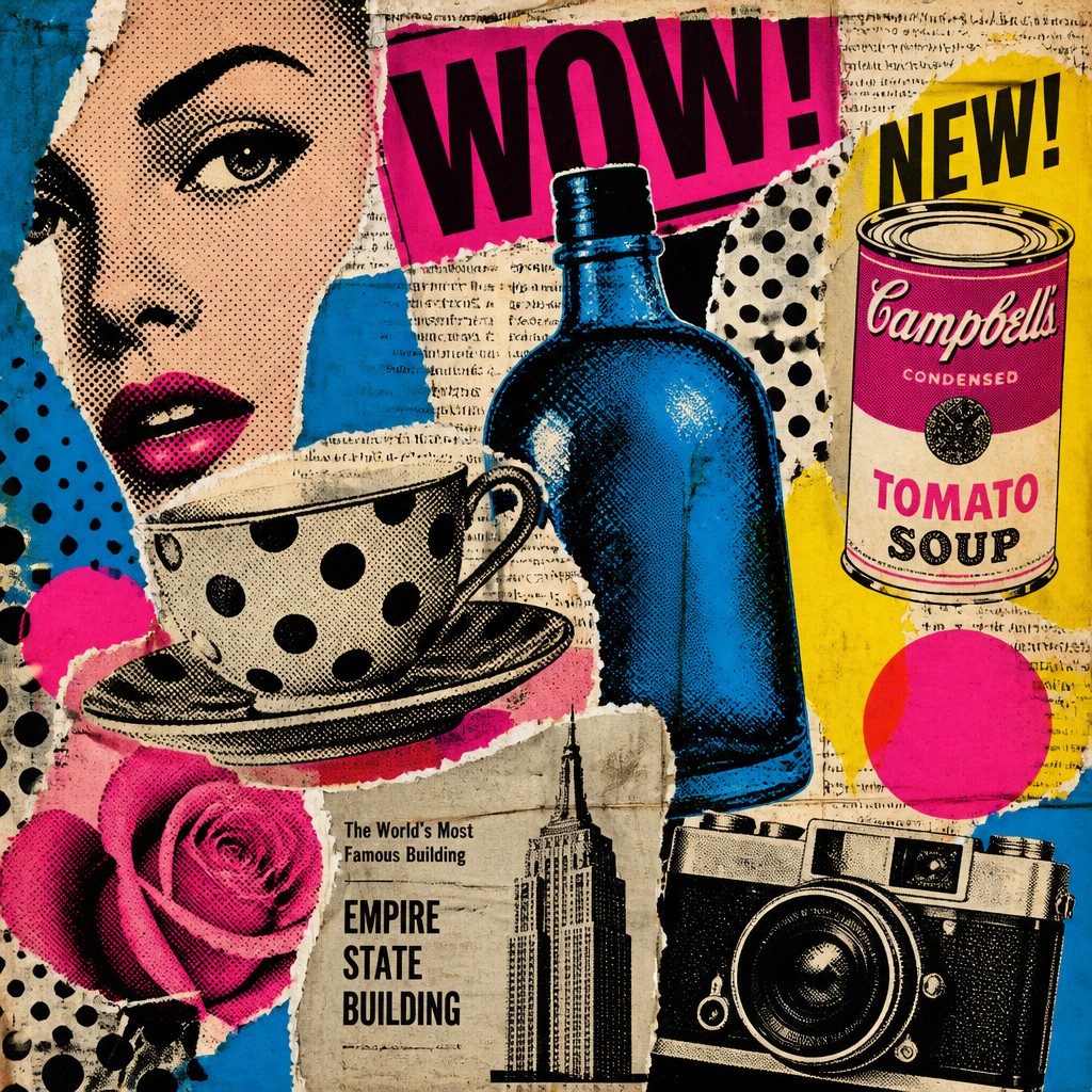
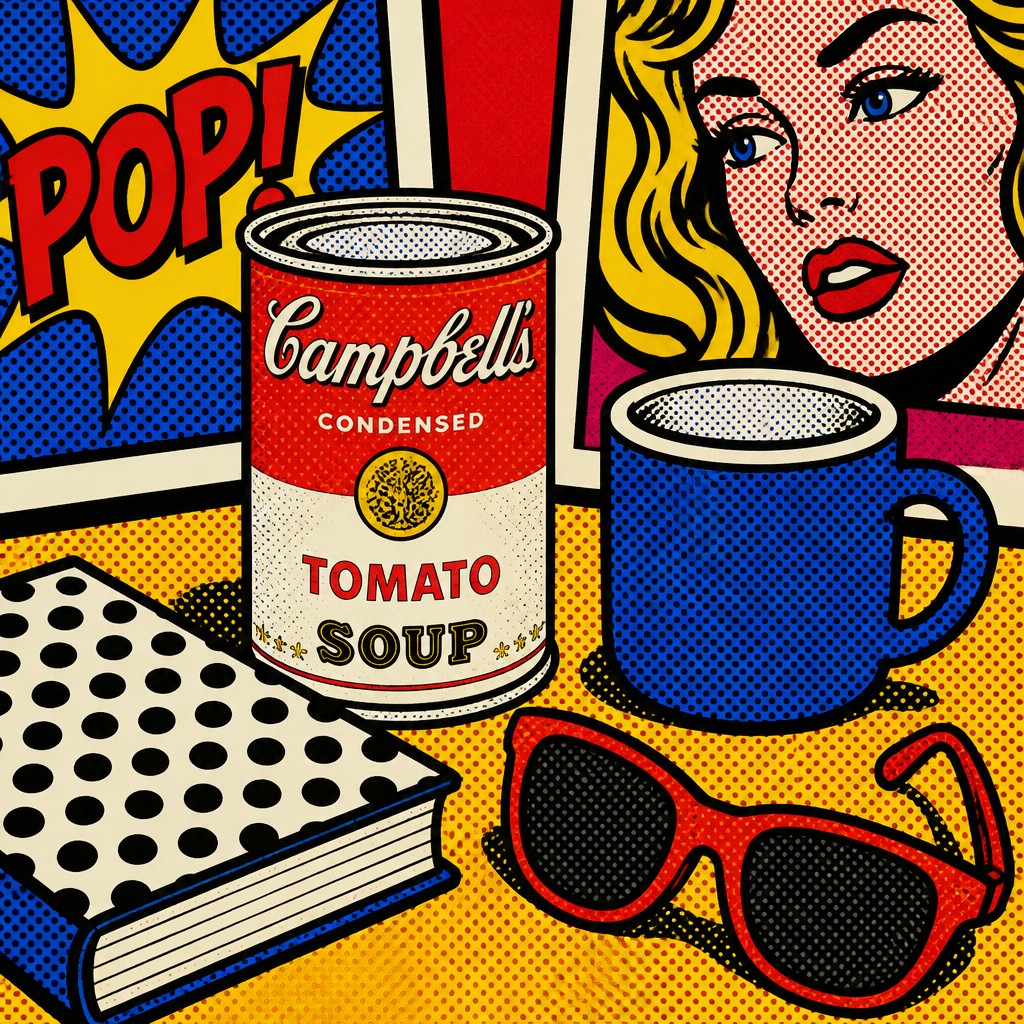
Each pair below was generated from the identical prompt — only the style changed.
“portrait of two people together”

“wide landscape with natural scenery”

“still life with everyday objects”
“bicyle resting against a wall”
Key Differences
| Collage Pop | Pop | |
|---|---|---|
| Surface texture | Layered paper edges, torn fragments, and visible overlaps. | Smooth, flat surfaces with minimal texture. |
| Color treatment | Bold CMYK mixes with printed noise and imperfect color layering. | High-contrast flat colors, often simplified and uniform. |
| Line & form | Forms are built from assembled pieces and irregular cut shapes. | Forms are defined by clean contours and thick outlines. |
| Print effects | Halftones sit beside torn graphics, creating a collage-like media mix. | Halftone dots are used more directly as a graphic pop-art device. |
| Visual mood | Busy, layered, and intentionally imperfect. | Bold, crisp, and instantly readable. |
| Best use cases | Great for editorials, posters, and designs needing tactile media richness. | Great for logos, campaigns, and graphics needing strong immediate impact. |
| Mood | playful, irreverent, subversive, urban, chaotic | bold, playful, commercial, ironic, vibrant |
| Energy | intense | lively |
| Detail level | detailed | moderate |
| Color | bold primaries, black, white, muted print tones | bright saturated primaries and contrasts |
| Texture | layered paper, rough edges, print noise | flat, printed, dot-patterned surface |
| Origin | 1960s commercial print culture, urban Western media | 1960s Britain and United States |
| Best for | posters, album covers, editorial spreads, zines, advertising parodies, social commentary | posters, album covers, editorial graphics, advertisements, book covers, merchandise design |
| Difficulty | moderate | moderate |
Which Should You Choose?
Pick Collage Pop Art Style when you want a textured, experimental look that feels assembled from printed materials and carries more visual complexity. Choose Pop Art Style when you want cleaner shapes, simpler color fields, and a sharper commercial graphic impact. If the message should feel layered and media-saturated, A is better; if it should feel bold, direct, and iconic, B is the stronger choice.
Frequently Asked Questions
Is Collage Pop Art Style just a more textured version of Pop Art Style?
Not exactly. It shares the same mass-media roots, but collage pop art relies on visible layering, torn edges, and mixed print textures. Pop art style is usually flatter and more graphic.
Which style is easier to read at a glance?
Pop Art Style is usually easier to read because it uses cleaner shapes and stronger visual separation. Collage Pop Art Style can be more detailed and layered, which adds richness but can reduce instant clarity.
Can both styles use halftone dots and bold color?
Yes, both commonly use halftones and strong color. The difference is that collage pop art treats these as part of a layered mixed-media surface, while pop art style usually presents them in a simpler, more direct graphic system.
Which style feels more handcrafted?
Collage Pop Art Style usually feels more handcrafted because it looks cut, pasted, and physically assembled. Pop Art Style can still feel designed and artful, but it tends to read as cleaner and more commercial.