Byzantine vs Byzantine Classical: What's the Difference?
Byzantine Art Style is a sacred visual tradition known for gold backgrounds, frontal icons, stylized figures, and rich spiritual symbolism. It emphasizes holiness over naturalism, using flattened space, formal poses, and luminous surfaces to support devotional meaning.
Byzantine Classical Art Style shares many of the same hallmarks, including gold grounds, frontal figures, flattened space, and symbolic content rooted in sacred image traditions. People compare the two because they overlap heavily in look and purpose, but one may feel more historically broad and the other more specifically icon-like and formally refined.
Same Prompt, Both Styles
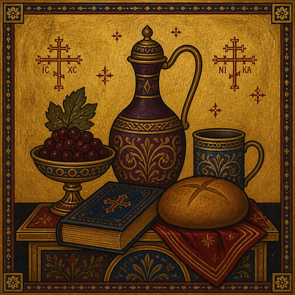
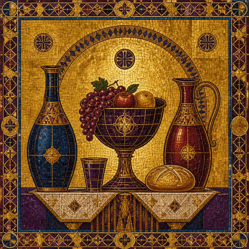
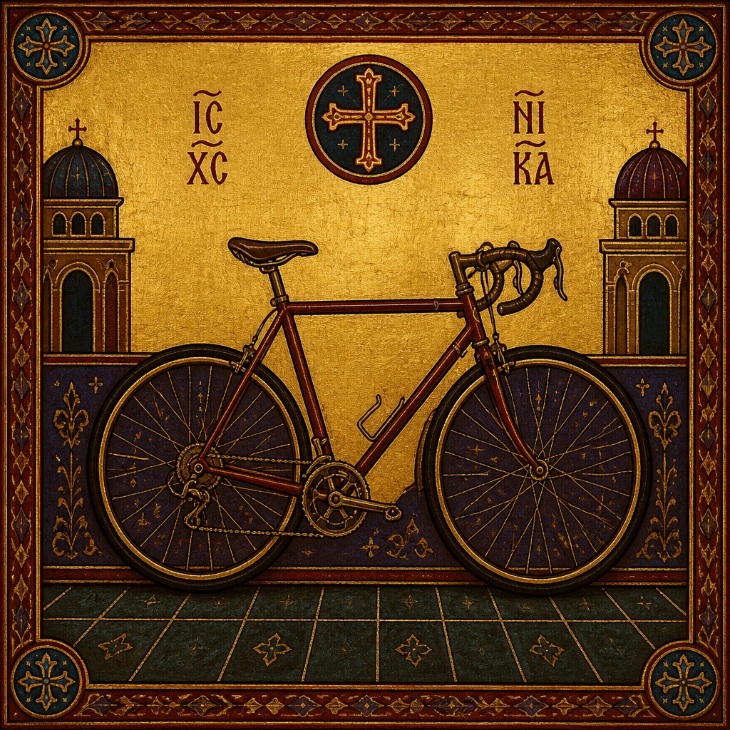
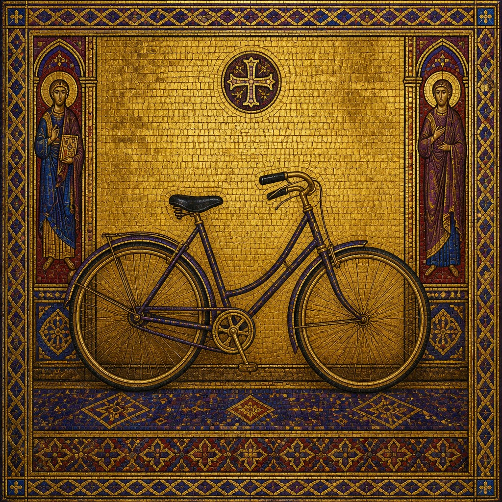
Each pair below was generated from the identical prompt — only the style changed.
“portrait of two people together”
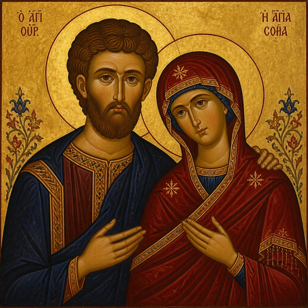
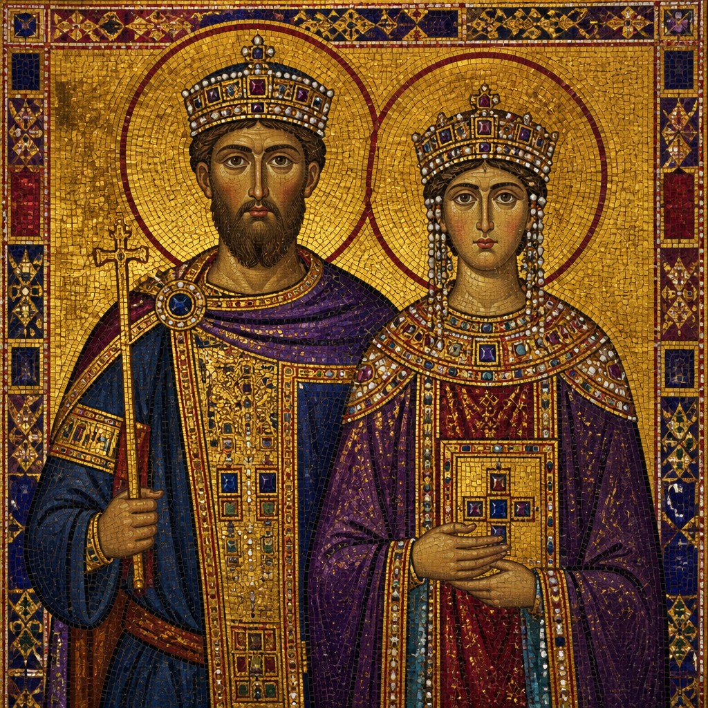
“wide landscape with natural scenery”
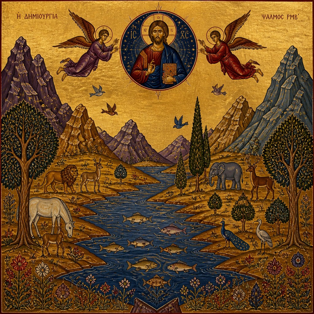
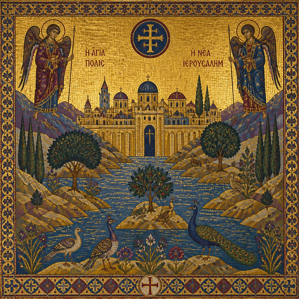
“still life with everyday objects”
“bicyle resting against a wall”
Key Differences
| Byzantine | Byzantine Classical | |
|---|---|---|
| Scope | Broader Byzantine sacred visual tradition across churches, mosaics, and icons. | More narrowly icon-centered and classically unified in appearance. |
| Visual emphasis | Prioritizes devotional symbolism and spiritual message. | Balances symbolism with a more standardized, elegant icon look. |
| Figure treatment | Figures are stylized and frontal, often highly hierarchical. | Figures are similarly frontal, but often more uniform and icon-formal. |
| Space and depth | Flattened or abstracted space supports transcendence. | Flattened space is equally present, with strong compositional clarity. |
| Surface and color | Gold backgrounds and rich color create a sacred, radiant atmosphere. | Gold grounds remain central, often with a cleaner, more restrained finish. |
| Historical feel | Reads as the wider historical Byzantine tradition. | Reads as a classicized version of Byzantine sacred imagery. |
| Mood | solemn, reverent, sacred, timeless | sacred, solemn, reverent, radiant |
| Energy | calm | calm |
| Detail level | detailed | detailed |
| Color | gold, deep blues, reds, and jewel tones | gold, deep blues, reds, jewel tones |
| Texture | flat, luminous, mosaic-like surfaces | mosaic-like, flat, luminous, iconographic |
| Origin | Eastern Roman Empire and Orthodox world | Byzantine Empire, late antique Eastern Mediterranean |
| Best for | religious icons, church mosaics, frescoes, illuminated manuscripts, historic posters | religious icons, church murals, mosaics, book illuminations, ceremonial posters, museum graphics |
| Difficulty | advanced | advanced |
Which Should You Choose?
Choose Style A if you want a broad Byzantine sacred look with strong historical and devotional associations, especially for mosaics, icons, or church-inspired compositions. Choose Style B if you want the same spiritual language but with a more polished, icon-like, and classically consistent appearance. If your goal is flexibility and tradition, pick A; if your goal is formal unity and a refined sacred icon aesthetic, pick B.
Frequently Asked Questions
Are these two styles actually very different?
They are closely related and often overlap in practice. The main difference is usually emphasis: Style A suggests a broader Byzantine tradition, while Style B suggests a more classicized icon-based version.
Do both styles use gold backgrounds?
Yes, gold grounds are common in both styles. They symbolize sacred light, timelessness, and a space beyond ordinary physical reality.
Which style is more realistic?
Neither style aims for naturalistic realism in the modern sense. Both favor stylization, frontal presentation, and symbolic clarity over anatomical accuracy or deep perspective.
Which style is better for religious imagery?
Both are well suited to religious imagery because both emphasize reverence and spiritual meaning. Choose based on whether you want a broader Byzantine tradition or a more icon-specific classical look.