Botanical Nature vs Traditional Botanical Still Life: What's the Difference?
Botanical Nature Art and Traditional Botanical Still Life Art both draw from scientific plant illustration, so they share a careful, observed look. Style A emphasizes fine linework, watercolor washes, and a specimen-plate feel that can make the image seem airy, archival, and subtly decorative.
Style B also uses precise linework and delicate watercolor, but it leans more toward documentary clarity and a still-life presentation of the plant as an arranged subject. People compare them because both are accurate, elegant, and plant-centered, yet one feels more like a natural-history plate while the other feels more like a disciplined botanical record.
Same Prompt, Both Styles
Each pair below was generated from the identical prompt — only the style changed.
“portrait of two people together”
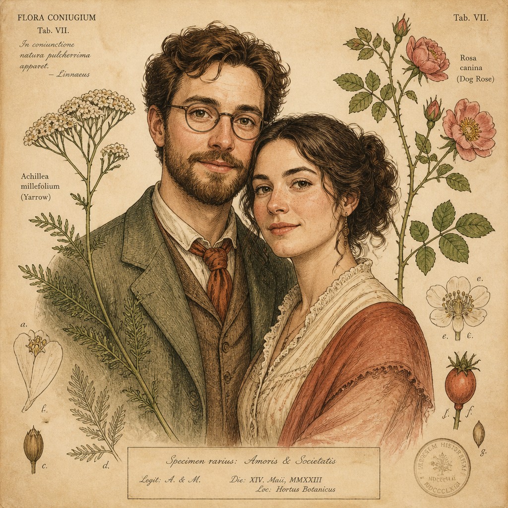
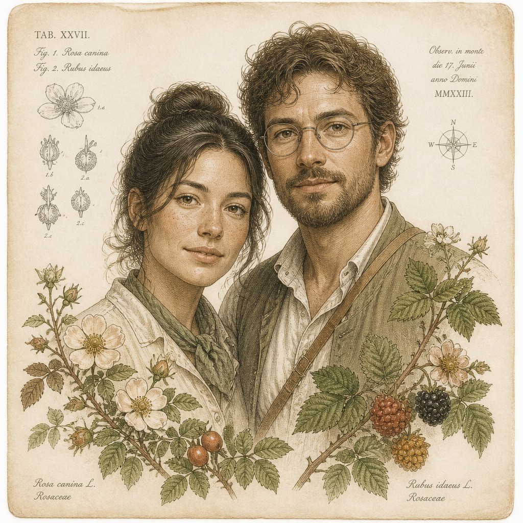
“wide landscape with natural scenery”
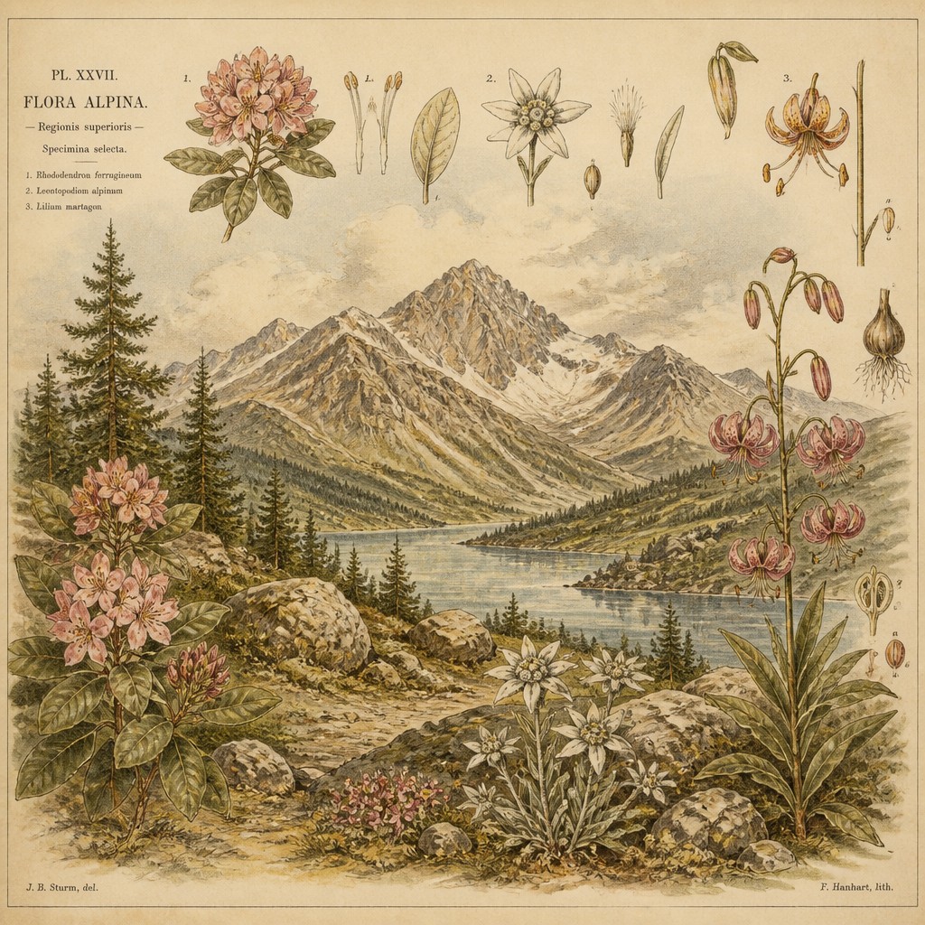
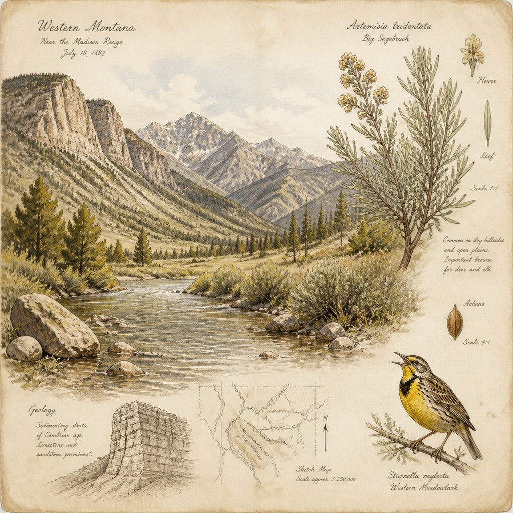
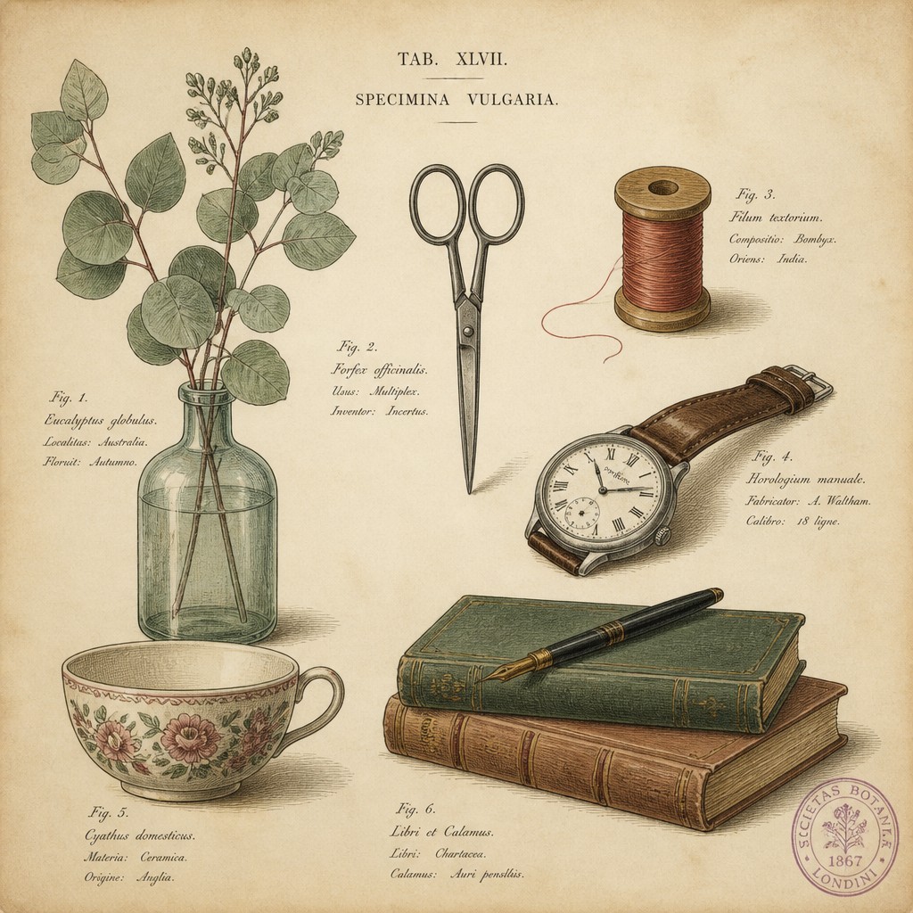
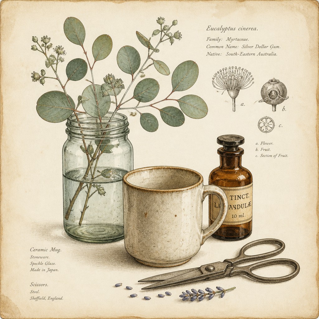
“still life with everyday objects”
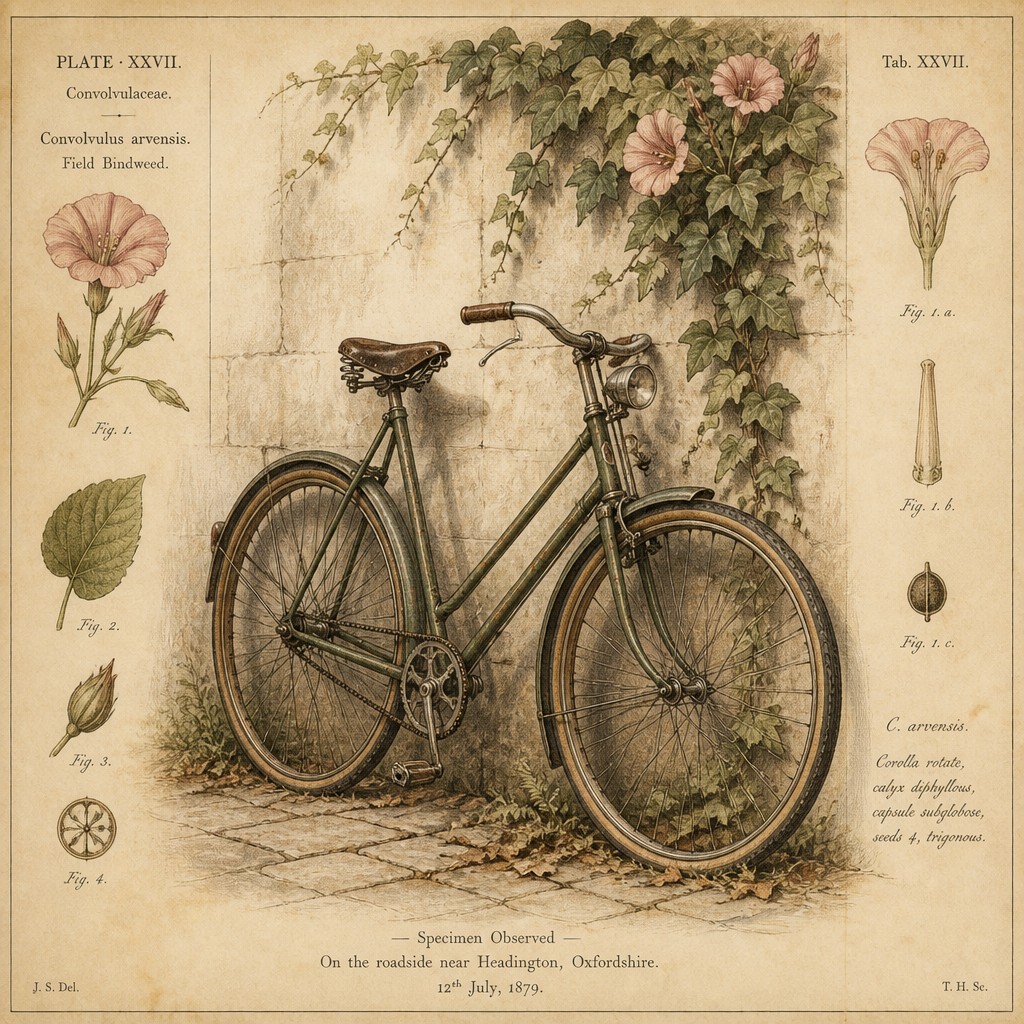
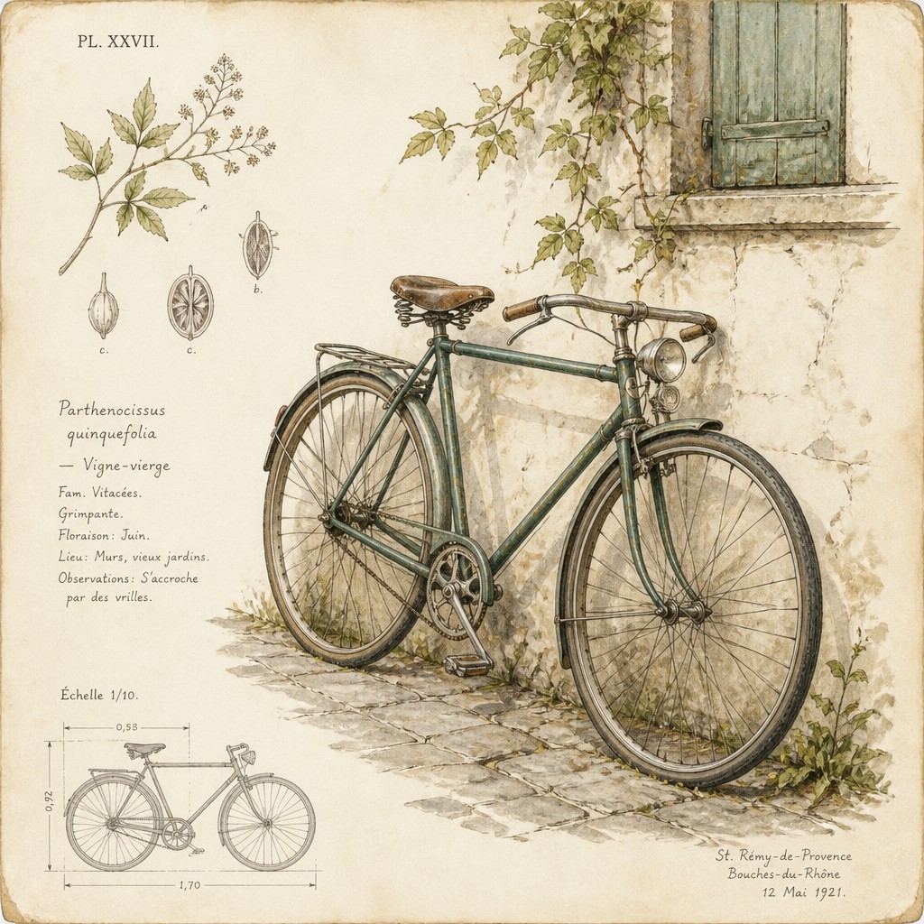
“bicyle resting against a wall”
Key Differences
| Botanical Nature | Traditional Botanical Still Life | |
|---|---|---|
| Overall mood | Airy, specimen-like, and lightly decorative. | Documentary, restrained, and observational. |
| Line & form | Fine outlines with a slightly ornamental finish. | Precise contours focused on structural clarity. |
| Color treatment | Gentle watercolor washes with antique softness. | Delicate washes used to support clear description. |
| Composition | Often presented like a labeled plate or collected specimen. | Often arranged like a studied botanical record. |
| Visual emphasis | Balances science with decorative elegance. | Prioritizes accurate documentation over ornament. |
| Historical feel | Suggests antique specimen plates and archive pages. | Suggests field notes, herbarium references, and study sheets. |
| Mood | refined, naturalistic, calm, elegant | observant, refined, serene, educational |
| Energy | calm | calm |
| Detail level | intricate | intricate |
| Color | muted greens, earthy tones, soft florals | naturalistic, muted, softly balanced |
| Texture | fine linework, delicate, crisp botanical surfaces | smooth paper, delicate botanical surfaces |
| Origin | 18th-century European botanical illustration | 18th-19th century Europe |
| Best for | field guides, scientific posters, decor prints, nature books, stationery | field guides, museum prints, editorial illustrations, botanical posters, educational books, stationery |
| Difficulty | advanced | advanced |
Which Should You Choose?
Choose Style A if you want a botanical image that feels graceful, collectible, and slightly more decorative while still being scientifically grounded. Choose Style B if you want the clearest sense of observation, classification, and plant structure. If the goal is visual charm with an antique plate atmosphere, pick A; if the goal is precise botanical documentation with a quieter presentation, pick B.
Frequently Asked Questions
Are these two styles basically the same?
They overlap a lot because both use scientific plant observation, fine linework, and watercolor. The difference is mainly in presentation: Style A feels more like a specimen plate, while Style B feels more like a documentary botanical study.
Which style is more scientific?
Both can be scientifically accurate if the drawing is careful and faithful to the plant. Style B usually reads as more explicitly documentary, so it often feels a bit more analytical.
Which style looks more decorative?
Style A usually looks more decorative because of its antique specimen-plate elegance. Style B is still beautiful, but it tends to keep ornamentation more subdued.
Which style works better for identification guides?
Style B is often the safer choice for guides because its emphasis on clarity and structure supports identification. Style A can also work well, especially when you want the guide to feel elegant and archival.