Baroque Religious vs Renaissance Religious: What's the Difference?
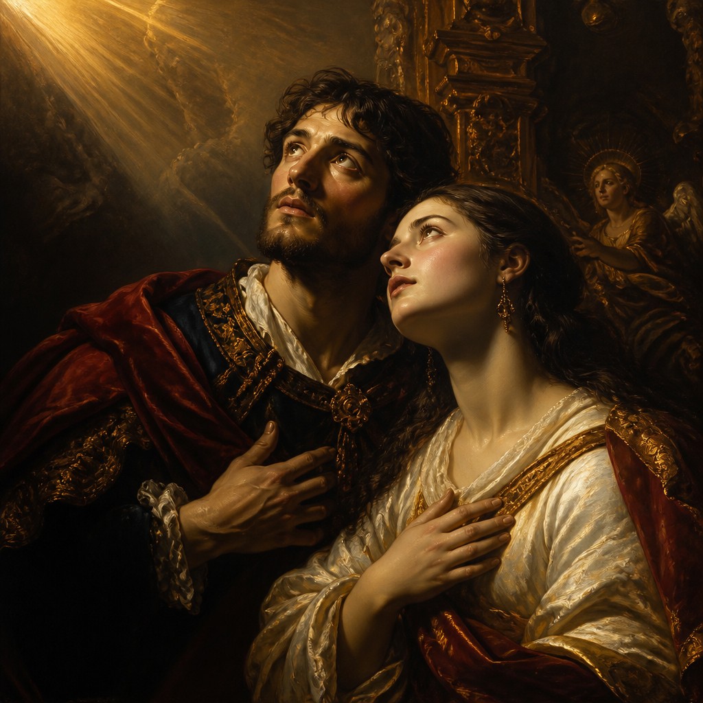
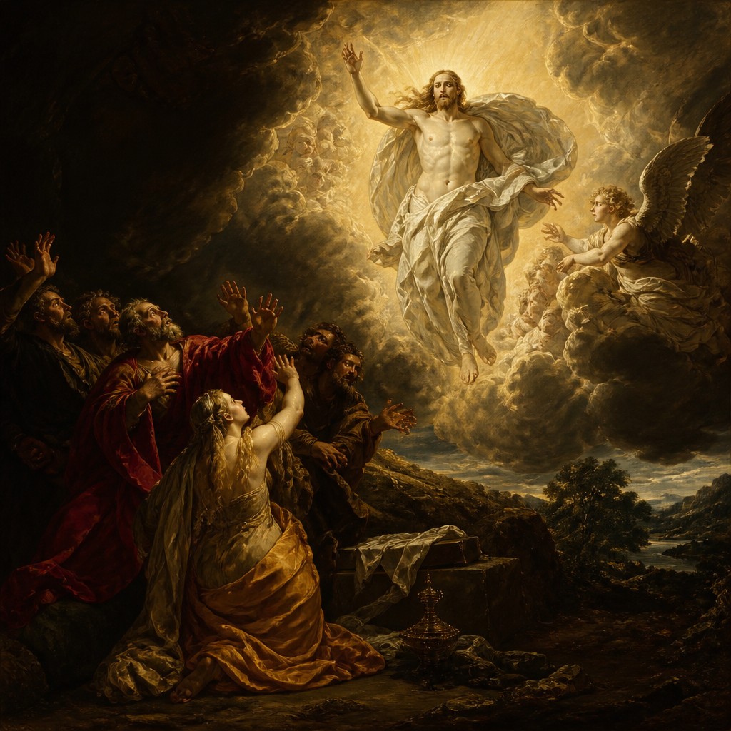
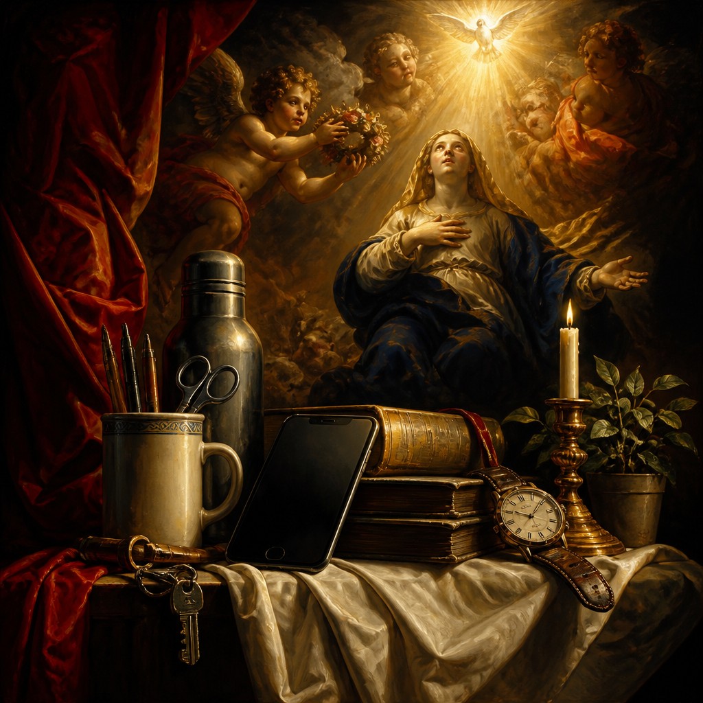
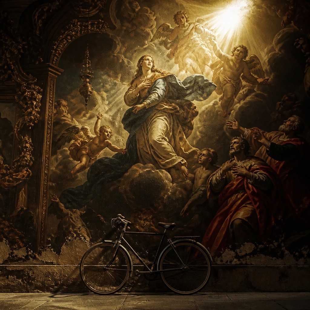
Baroque Religious Art and Renaissance Religious Art are both rooted in Christian imagery, but they express faith in very different ways. Baroque religious painting uses dramatic light, strong movement, and emotional intensity to create a vivid, theatrical sense of devotion, often echoing the grandeur of Catholic altarpieces.
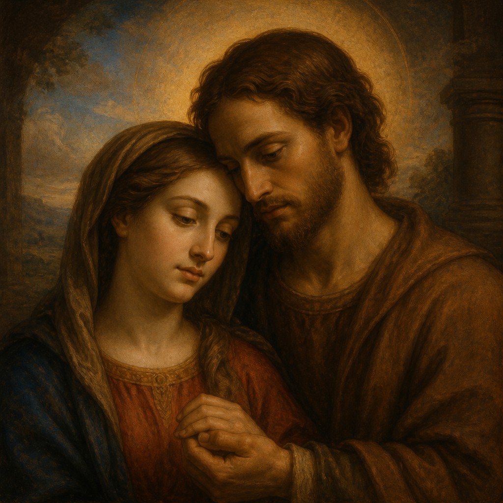
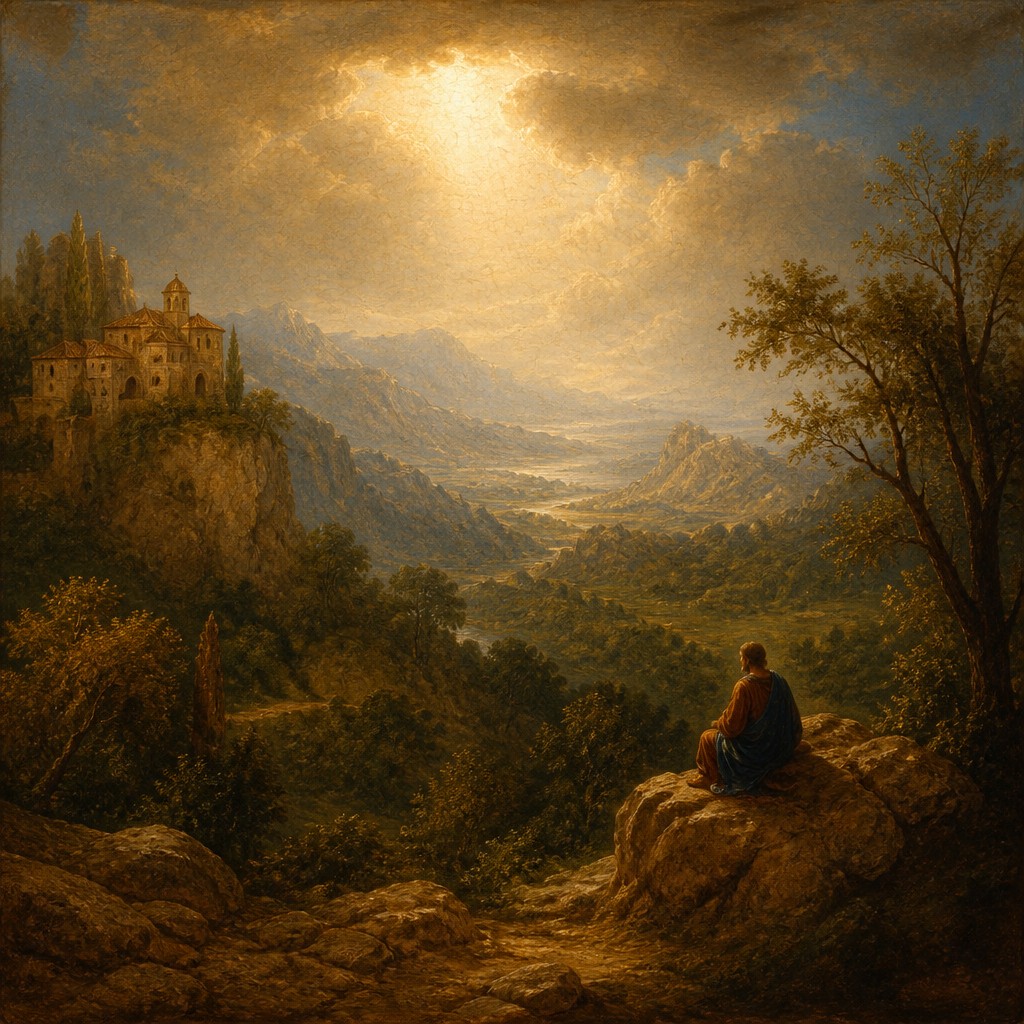
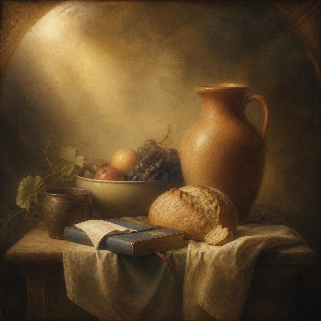
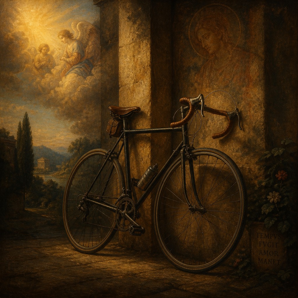
Renaissance religious painting is more measured and classical, emphasizing balanced composition, idealized figures, clear perspective, and harmonious color. People compare these styles because both portray sacred subjects, yet one aims to move the viewer through drama while the other seeks to inspire through order, beauty, and spiritual clarity.
Same Prompt, Both Styles
Each pair below was generated from the identical prompt — only the style changed.
“portrait of two people together”
“wide landscape with natural scenery”
“still life with everyday objects”
“bicyle resting against a wall”
Key Differences
| Baroque Religious | Renaissance Religious | |
|---|---|---|
| Mood | Dramatic, urgent, and emotionally charged. | Calm, balanced, and contemplative. |
| Light | Strong chiaroscuro and gilded theatrical illumination. | Luminous, even lighting with gentler contrast. |
| Figures | Naturalistic bodies in intense poses and expressions. | Idealized bodies with serene, proportioned faces. |
| Composition | Dynamic diagonals, crowding, and dramatic movement. | Stable symmetry and clear spatial organization. |
| Devotional effect | Aims to overwhelm and stir immediate faith. | Aims to instruct, uplift, and inspire reverence. |
| Color and surface | Rich contrasts, deep shadows, and glowing highlights. | Bright, harmonious color with polished clarity. |
| Mood | dramatic, reverent, solemn, emotional, exalted | reverent, solemn, harmonious, uplifting |
| Energy | intense | balanced |
| Detail level | detailed | detailed |
| Color | deep shadows, rich golds, warm earth tones | rich earth tones, luminous skin, deep blues, gold accents |
| Texture | painted, luminous, tactile brushwork | smooth paint, soft modeling, polished surfaces |
| Origin | 17th-century Catholic Europe, especially Italy and Spain | 15th-16th century Italy |
| Best for | church murals, religious posters, book illustrations, museum exhibits, dramatic album covers | altar images, museum reproductions, religious posters, historical book covers, meditative wall art |
| Difficulty | advanced | advanced |
Which Should You Choose?
Choose Baroque Religious Art if you want emotional intensity, dramatic lighting, and a sense of sacred spectacle that pulls viewers into the scene. Choose Renaissance Religious Art if you prefer balanced composition, idealized beauty, and a quieter devotional tone grounded in classical harmony. In short, pick A for theatrical impact and spiritual urgency, and pick B for order, clarity, and serene reverence.
Frequently Asked Questions
Which style feels more dramatic?
Baroque Religious Art is much more dramatic. It uses powerful contrasts, movement, and expressive gestures to create urgency and emotional impact.
Which style is more idealized?
Renaissance Religious Art is generally more idealized. Figures are usually proportioned, composed, and serene, with an emphasis on harmony and classical beauty.
Do both styles use chiaroscuro?
Yes, both can use chiaroscuro, but differently. Renaissance artists often use it to model form clearly, while Baroque art uses it more theatrically for contrast and drama.
Which is better for a calm devotional space?
Renaissance Religious Art is often better for a calm devotional space. Its balanced composition and luminous color support reflection rather than intense emotional reaction.